主题

制作响应式漂亮布局
上一页内容,我们了解了页面布局,并且制作了一个可用的 Layout 组件,但是太单调,现实中肯定不可能用这样的页面给用户使用的。所以这一节内容我们先不急着下面的功能介绍,先来制作一个漂亮的布局,让身心愉悦起来。但为了不必要浪费时间在制作页面(写 css)上,所以我们选择了现在非常流行的原子化 css 框架,漂亮且易于使用。
tailwindcss 介绍
Tailwind CSS 是一个高度实用、原子化的 CSS 框架,其设计目标是通过提供丰富的类名来快速构建现代化、响应式的 Web 界面。实现响应式设计需要编写大量的媒体查询代码。Tailwind CSS 内置了简洁明了的响应式类名,使得响应式设计变得简单直接。个人使用 tailwindcss 的最大感受,看到基于 tailwindcss 的页面代码可以直接复制使用。还有本教程的重点不在页面 css 上,所以使用它可以直接到他的官网复制制作好的页面 html 代码。所见即所得 tailwindcss 文档
TIP
还有一点就是,为了减少入门教程的负担,教程里面不会安装任何前端依赖,所有前端组件都是以 CDN 方式引入
WARNING
如果不做特殊说明,所有的 html 代码都是从 tailwindui 组件复制而来
重写 Layout 组件
教程中所有的代码都是可以直接复制的,为了配合教程,所有tailwindcss 模板代码都是经过本人二次修改后贴入到教程中的。所以如果你在实际开发中使用 tailwindcss, 记得一定要根据实际需求进行修改。下面是修改后的 layout 代码。
TIP
html 标签内的 class 都是使用的 tailwindcss 原子化标签,如果不了解,一定要半小时时间看一下 tailwindcss 文档,非常好理解
html
<!DOCTYPE html>
<html class="h-full bg-gray-100">
  <head>
    <meta charset="utf-8" />
    <meta name="viewport" content="width=device-width, initial-scale=1" />

    <!-- 记得一定要引入 tailwindcss cdn -->
    <script src="https://cdn.tailwindcss.com"></script>
    <title>Laravel</title>
  </head>
  <body class="h-full">
    <div class="min-h-full">
      <nav class="bg-gray-800">
        <div class="px-4 mx-auto max-w-7xl sm:px-6 lg:px-8">
          <div class="flex justify-between items-center h-16">
            <div class="flex items-center">
              <div class="flex-shrink-0">
                <img class="w-8 h-8 rounded-full" src="https://image.catchadmin.com/202405190952202.png" />
              </div>
              <div class="hidden md:block">
                <x-nav class="flex items-baseline ml-10 space-x-4" />
              </div>
            </div>
            <div class="hidden md:block">
              <div class="flex items-center ml-4 md:ml-6">
                <button
                  type="button"
                  class="relative p-1 text-gray-400 bg-gray-800 rounded-full hover:text-white focus:outline-none focus:ring-2 focus:ring-white focus:ring-offset-2 focus:ring-offset-gray-800">
                  <span class="absolute -inset-1.5"></span>
                  <span class="sr-only">View notifications</span>
                  <svg class="w-6 h-6" fill="none" viewBox="0 0 24 24" stroke-width="1.5" stroke="currentColor" aria-hidden="true">
                    <path
                      stroke-linecap="round"
                      stroke-linejoin="round"
                      d="M14.857 17.082a23.848 23.848 0 005.454-1.31A8.967 8.967 0 0118 9.75v-.7V9A6 6 0 006 9v.75a8.967 8.967 0 01-2.312 6.022c1.733.64 3.56 1.085 5.455 1.31m5.714 0a24.255 24.255 0 01-5.714 0m5.714 0a3 3 0 11-5.714 0" />
                  </svg>
                </button>

                <!-- Profile dropdown -->
                <div class="relative ml-3">
                  <div>
                    <button
                      type="button"
                      class="flex relative items-center max-w-xs text-sm bg-gray-800 rounded-full focus:outline-none focus:ring-2 focus:ring-white focus:ring-offset-2 focus:ring-offset-gray-800"
                      id="user-menu-button"
                      aria-expanded="false"
                      aria-haspopup="true">
                      <span class="absolute -inset-1.5"></span>
                      <span class="sr-only">Open user menu</span>
                      <img class="w-8 h-8 rounded-full" src="https://image.catchadmin.com/202405190952202.png" alt="" />
                    </button>
                  </div>
                </div>
              </div>
            </div>
            <div class="flex -mr-2 md:hidden">
              <!-- Mobile menu button -->
              <button
                type="button"
                class="inline-flex relative justify-center items-center p-2 text-gray-400 bg-gray-800 rounded-md hover:bg-gray-700 hover:text-white focus:outline-none focus:ring-2 focus:ring-white focus:ring-offset-2 focus:ring-offset-gray-800"
                aria-controls="mobile-menu"
                aria-expanded="false">
                <span class="absolute -inset-0.5"></span>
                <span class="sr-only">Open main menu</span>
                <!-- Menu open: "hidden", Menu closed: "block" -->
                <svg class="block w-6 h-6" fill="none" viewBox="0 0 24 24" stroke-width="1.5" stroke="currentColor" aria-hidden="true">
                  <path stroke-linecap="round" stroke-linejoin="round" d="M3.75 6.75h16.5M3.75 12h16.5m-16.5 5.25h16.5" />
                </svg>
                <!-- Menu open: "block", Menu closed: "hidden" -->
                <svg class="hidden w-6 h-6" fill="none" viewBox="0 0 24 24" stroke-width="1.5" stroke="currentColor" aria-hidden="true">
                  <path stroke-linecap="round" stroke-linejoin="round" d="M6 18L18 6M6 6l12 12" />
                </svg>
              </button>
            </div>
          </div>
        </div>

        <!-- Mobile menu, show/hide based on menu state. -->
        <div class="md:hidden" id="mobile-menu">
          <x-nav class="px-2 pt-2 pb-3 space-y-1 sm:px-3" />
          <div class="pt-4 pb-3 border-t border-gray-700">
            <div class="flex items-center px-5">
              <div class="flex-shrink-0">
                <img class="w-10 h-10 rounded-full" src="https://image.catchadmin.com/202405190952202.png" alt="" />
              </div>
              <div class="ml-3">
                <div class="text-base font-medium leading-none text-white">Tom Cook</div>
                <div class="text-sm font-medium leading-none text-gray-400">tom@example.com</div>
              </div>
              <button
                type="button"
                class="relative flex-shrink-0 p-1 ml-auto text-gray-400 bg-gray-800 rounded-full hover:text-white focus:outline-none focus:ring-2 focus:ring-white focus:ring-offset-2 focus:ring-offset-gray-800">
                <span class="absolute -inset-1.5"></span>
                <span class="sr-only">View notifications</span>
                <svg class="w-6 h-6" fill="none" viewBox="0 0 24 24" stroke-width="1.5" stroke="currentColor" aria-hidden="true">
                  <path
                    stroke-linecap="round"
                    stroke-linejoin="round"
                    d="M14.857 17.082a23.848 23.848 0 005.454-1.31A8.967 8.967 0 0118 9.75v-.7V9A6 6 0 006 9v.75a8.967 8.967 0 01-2.312 6.022c1.733.64 3.56 1.085 5.455 1.31m5.714 0a24.255 24.255 0 01-5.714 0m5.714 0a3 3 0 11-5.714 0" />
                </svg>
              </button>
            </div>
            <div class="px-2 mt-3 space-y-1">
              <a href="#" class="block px-3 py-2 text-base font-medium text-gray-400 rounded-md hover:bg-gray-700 hover:text-white">Your Profile</a>
              <a href="#" class="block px-3 py-2 text-base font-medium text-gray-400 rounded-md hover:bg-gray-700 hover:text-white">Settings</a>
              <a href="#" class="block px-3 py-2 text-base font-medium text-gray-400 rounded-md hover:bg-gray-700 hover:text-white">Sign out</a>
            </div>
          </div>
        </div>
      </nav>

      <header class="bg-white shadow">
        <div class="px-4 py-6 mx-auto max-w-7xl sm:px-6 lg:px-8">
          <h1 class="text-3xl font-bold tracking-tight text-gray-900">Dashboard</h1>
        </div>
      </header>
      <main>
        <div class="py-6 mx-auto max-w-7xl sm:px-6 lg:px-8">
          <!-- 内容插槽 -->
          {{ $slot}}
        </div>
      </main>
    </div>
  </body>
</html>导航
不光 layout 组件,导航组件也重新修改了。由于 layout 代码中的导航组件在 pc 端和移动端显示的效果不一样,需要不同 css 样式,所以这里需要给导航组件添加一个组件属性 $attributes,利用这个组件属性可以传递额外的 html 属性给组件。详细可以通过组件属性文档了解下
html
<div {{ $attributes }}>
  <a href="/" class="block px-3 py-2 text-base font-medium text-white bg-gray-900 rounded-md" aria-current="page">首页</a>
  <a href="/profile" class="block px-3 py-2 text-base font-medium text-gray-300 rounded-md hover:bg-gray-700 hover:text-white">个人资料</a>
  <a href="/contact" class="block px-3 py-2 text-base font-medium text-gray-300 rounded-md hover:bg-gray-700 hover:text-white">联系方式</a>
</div>
然后再回到 Layout 组件,我们来看下 nav 组件是如何使用的。导航组件在 Layout 中使用了两次,分别使用了不同的 class,由于 $attributes 的原因,两次显示了不同 class 导致显示效果的不同,分别看下。
导航 pc 端显示效果
html
<x-nav class="flex items-baseline ml-10 space-x-4" />
导航移动端显示效果
html
<x-nav class="px-2 pt-2 pb-3 space-y-1 sm:px-3" />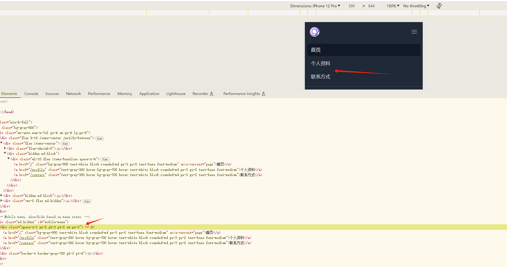
最终效果如下图 
这再也不是上一篇超简陋的页面,现在还是蛮好的。但这里还有一个问题,就是图中箭头所指的地方。这应该也是每个页面都变化的地方,在点击链接之后,应该也会发生变化。 理想的效果可以在首页 home.blade.php 可以传递一个值给到 Layout 组件,自定义修改。那么可不可以实现呢?答案是肯定,首先来到 Layout 组件,找到这个箭头对应 的代码,在上面演示代码的 92~96 行
html
<header class="bg-white shadow">
  <div class="px-4 py-6 mx-auto max-w-7xl sm:px-6 lg:px-8">
    <h1 class="text-3xl font-bold tracking-tight text-gray-900">Dashboard // [!code --]</h1>
    <h1 class="text-3xl font-bold tracking-tight text-gray-900">{{ $header }} // [!code ++]</h1>
  </div>
</header>
在这里我们将 Dashboard 这个固定字符替换成了 header 变量,这个时候你回到浏览器刷新页面,你会发现页面报错,如下 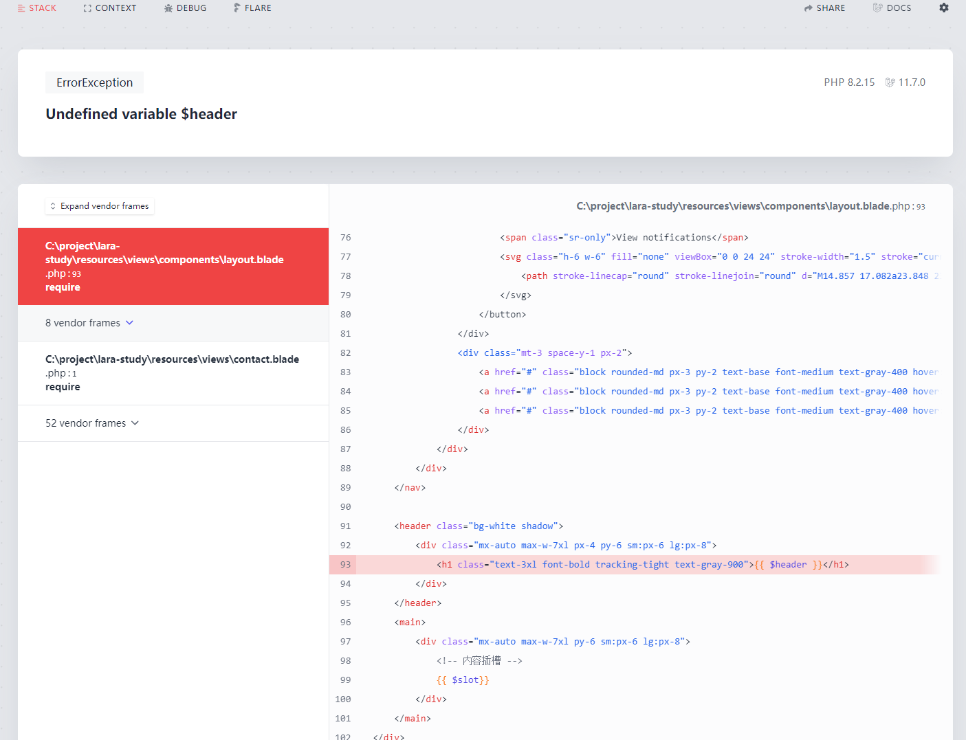 因为模板上有个 header 变量,但是在模板渲染的时候没有被定义,所以报错
 Undefined variable $header。那么我们该如何解决这个错误呢?仔细想一下,这个变量是在 layout 组件中定义。 那么就需要在使用 layout 组件的时候将 header 变量传过去就可以了。目前 layout 组件在三个页面中使用。首先到 home.blade.php 模板中。在这里教程提供两种方式来解决这个问题
第一个就是直接通过属性透传过去,通俗一点来说,你可以讲这个 header 变量当做 layout 组件的一个属性,如下
html
<!-- header 属性 -->
<x-layout header="首页">
  <h1>这是首页</h1>
</x-layout>
第二种方式呢,是以命名插槽的方式传递数组。还记得上一篇提到的插槽内容吗?默认情况下呢,组件内容都会被覆盖到 $slot 变量。但如果你需要置顶插槽,那么就需要这个命名插槽的功能。header 变量你也可以认为是一个插槽。但不是默认的,需要你使用 <x-slot> 置顶他的内容,看一下示例代码
html
<!-- <x-slot:变量名称> 的方式 -->
<x-layout>
  <x-slot:header>首页</x-slot:header>
  <h1>这是首页</h1>
</x-layout>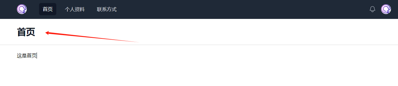
当然不要忘了,还有其他两个页面也是需要使用这种方法修改 header 信息
html
<x-layout>
  <x-slot:header>个人资料</x-slot:header>
  <h1>这是个人信息页面</h1>
</x-layout>
html
<x-layout>
  <x-slot:header>联系方式</x-slot:header>
  <h1>这是个人联系页面</h1>
</x-layout>
再回到浏览器,访问各个页面,你会发现 Dashboard 已经会根据页面的变化而变化了。是不是非常简单和神奇?注意迄今为止,我们只在 view 层开发,但是已经可以很好的实现动态效果了, 这就是 Laravel 框架的强大的地方